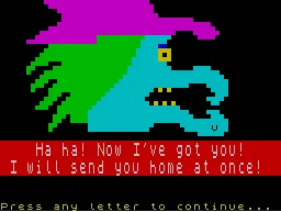
why does this site look like the BBC Micro game Granny’s Garden but without the charming pixel art?
I’ve always been attracted to some retro aesthetics with my online stuff and normally can’t resist a good typewriter font. This is probably because I started out as a serious writer with a typewriter and I often get nostalgic about those early days and the creative frenzies that accompanied them.
I’ve always been attracted to some retro aesthetics with my online stuff and normally can’t resist a good typewriter font. This is probably because I started out as a serious writer with a typewriter and I often get nostalgic about those early days and the creative frenzies that accompanied them.
But this site isn’t about being a serious writer, it’s about playing around and there’s something about the 8/16bit computer font that, for me, accentuates this playfulness. It also reminds me of all the Indie, Pico-8 and Bitsy games that seem to push the imagination further because of the boundaries they have to work through. I spent a few childhood afternoons typing out BASIC code from a page of a magazine on the rubber keys of a ZX81 or Spectrum in the hope that, if I got it all right, a game would suddenly come into being from all that inpenetrable syntax.
In some ways, that’s what I’m doing now, hammering out sentences in the hope that something magical will happen. The look of this blog reminds me that this is all just another form of play and that none of it is very important.
